Thursday, August 28, 2008

Task Five: Video Reflections - 'Paul Bennett - Designing Details'

I found this presentation to be extremely interesting as it taught me the importance of observing human interactions. It was interesting how Paul pointed out that we humans design things without realizing it. The one i found most interesting was how we wrap the tea bag string around the handle of a cup. I found this detail interesting as i had never thought of these everyday things to be a design in themselves.

I agreed with Paul's thoughts on becoming the consumer and putting yourself in their shoes to understand exactly what they need and want. I thought that the major take home message of the video was to remind the viewer that although making a design 'pretty' was relevant, the main purpose of design is the function and the convenience of the product itself. This idea can be seen in Paul's work at the hospital. The mirrors installed on wheelchairs for better interaction showed that even the simplest of designs can be the best ones.

I believe that as designers we must design with our hearts and truly have a look at the world around us, to gain the outside picture and look outside the box.

Product Sketching - Powerhouse Museum

"Colgate Toothbrush"


Designer: Colgate
Manufactured: ?
I was inspired by this toothbrush as it was the only small product to sketch in the particular exhibit. Toothbrushes are an excellent invention and are designed to be very ergonomic.


"Avant- Garde Office Swivel Chair"


Designer: Clement Meadmore
Manufactured: 1961
I chose this design as it was very symmetrical and i found it to be very interesting. It is a very iconic chair as many swivel chairs seem to look similar or are based around this chair.


"Table Vase"


Designer: Phillipe Starck
Manufactured: 1988
I found this to be a very interesting design as it was modern yet designed decades ago. I found the legs of the table to be very innovative and that is why i chose to draw this product.


"Gardening Tool"


Designer: Cyclone Industries
Manufactured: ?

I found this gardening tool to be designed ergonomically as all the features of the hand and where they would be placed were taken into consideration.


Thursday, August 21, 2008

Task Five: Video Reflections - 'Yves Behar - Designing objects that tell stories'

I found this video to be very interesting and clear in meaning. I thought that the main message of the speech was to outline the importance of passion in design. I especially agreed with his views on how we must make our designs humanistic so that we can create relationships between our products and the users.

The design which had most impact on me, was the 'Y water bottles'. I found these to be quite ingenious as they mixed a fun element to something that could seem bland. I believe that this is the aim to true design. Giving delight in something which seems boring.

I learnt that in design, we must pour our souls, our values and our passion into the products we create. And even if someone does not agree with this, we should believe in the original idea. It may not always be correct, but if we keep stripping back to the original idea, something great can be achieved.

Wednesday, August 13, 2008

Task Five: Video Reflections - 'Ross Lovegrove: Organic Design'

I found Ross Lovegrove's presentation on his views of organic design extremely interesting.
I learnt and appreciated many interesting aspects of design through his speech.
The first thing i learnt was about form, and how form was something that could touch people's soul and emotion. Ross also emphasized on the need to look at natural forms instead of artificially produced ones. Although technology can be great aid in design, he's speech outlined the need for instinct in a designer rather then one who was just great in the technological field. I especially enjoyed and agreed with his thought on how observation, curiosity and instinct could create amazing art, in the form of industrial design. He's speech taught me not to bother with too many petty details in the beginning such as "how will i make this product". Instead to create exactly what you dream and envision and FIND a way of making it work.

The Tynant bottle designed by Ross was very beautiful. I was especially impressed as he had started off with a few blue squiggles as a representation of water and transformed it into such a beautiful bottle. When i first saw the squiggles i was a bit skeptical of how that would be translated into a product. However i later learnt from this that i should not care what other people think of my design and concepts, as long as I believe in it, there is a possibility that it could turn out great.

Ross' outlook on the endless possibilities of materials was also fascinating. He thought of new and innovating ways to make his products out of, and was not put down by insults such as the one from Sony.

The main message i took from the video was that nature improves with purpose, and that i should always trust my instincts. These instincts will lead me to innovative thoughts. It also taught me not to just look at artificial forms and structures but take in natural forms for inspiration. Observation is the key for the design process.


Thursday, August 7, 2008

Task Five: Video Reflections - 'David Kelley - Human Centred Design'

Week Two Video Reflection: 'David Kelley - Human Centered Design'

Ever since I started industrial design, I thought of it as more of a technical, engineering based design course. Obviously there was a design aspect to it, but i believed that it was also very structured and technical. However after watching the speech which David Kelley delivered i believe i have learnt that what i originally thought was just a superficial view and that it was just the outer appearance of industrial design can seem. Instead i have started to understand that there are much more human and personal aspects to industrial design that i ever imagined. I believe that the main message of the video is that: design is much more then just the product itself and how it functions, instead it is about how consumers interact with it and how personal it is to the consumer and the product's ability to move someone and evoke feelings. In short, a product which is designed for the person, with only the person in mind, instead of a product which is just there to do something.

I felt that the design for the Prada store was a great example of human centered design. Although its main feature was to keep track of the clothing taken in and which clothes the consumer was interested in, the product made was taken one step further, and was actually designed for the customer. Fulfilling its actual purpose yet keeping the consumer and the aim to facilitate to their needs in mind. I also found the mirror with the three second delay very interesting as it was a great yet simple idea, which met to the consumers needs. This meant that the designers actually had a sat down, and instead of just designing a mirror, they had to brainstorm what the consumer would want and what they would need in that situation.

In the dilbert space video, it was interesting to see how much human interaction and research was preformed to ensure an outcome to the brief. A feature to show the importance of human personality involved in a products design, was the flower feature which would wilt when the person left their space.

The last segment of the video about the Approtec Kenya project really made me think carefully about the design opportunities created just from one innovative approach to a problem. It showed me that design could take place anywhere and anytime with the right ideas and solutions.

David Kelley's speech about human centered designs really opened up my mind to the endless possibilities in design and the personal and human aspect to it.

Task One: Shape of a Scent


N: Ultraviolet Man by Paco Rabanne


When our group first smelt scent 'N', we had mixed reactions. Although it was clearly a men's scent, there was a strong sweetness to the scent which led us to believe that maybe it could be from a unisex perfume. Although it was masculine, it had a softer side to it due to the sweetness which gave the impression of a softer side to the man who wore it. The smell was comforting and very simple, as it was not one that was unique. Instead, it smelt strangely like that of a man's deodorant or aftershave, meaning it had a familiarity to it. The scent for me, represented a mans comfort yet at the same time, had a softness to it. This is why i have two different faces to the perfume bottle. The shape was meant to represent a bean bag or a chair which had been worn with comfort. Yet on the opposite side there was a slightly different layered shape, to show the sweet softness as a contrast to the simple masculinity.

Wednesday, August 6, 2008

Task Two: Good Design


Product: Sensear SP1x
Designer: KWA Design
Manufacturer: Sensear PTY Ltd


[Brief Overview and description]

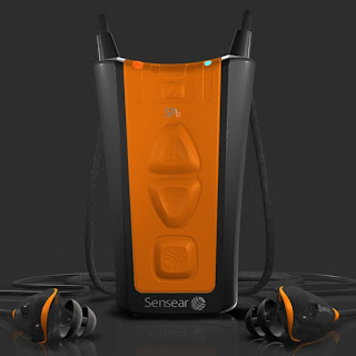
The Sensear SP1x is described as the world's first communication enabled electronic earplug which gives advanced protection against loud harmful noises from that of heavy construction sites. However its ability to enhance and assist any form of communication easily through high noise environments, whether it be face to face, through mobile phone, or two way radio, makes this product truly amazing.

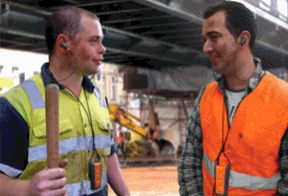
The earphones enable the user to effectively communicate with their surrounding individuals or on the mobile phone through bluetooth technology without ever having to take off the earphone, which reduces the need for harmful exposure to loud noises.

The product's highly advanced filtering technology is able to differentiate between background noise and speech properties which allows it to suppress loud noises without distorting speech. Its design is simple yet has a modern and funky feel, with its mp3 interface and its use of the contrasting colours of fluro orange and black.

The Sensear SP1x was designed to be used for individuals working in the high noise industry. Sensear's managing director, Justin Miller stated, "Our product has the potential to dramatically reduce the incidence of Noise Induced Hearing Loss (NIHL) in the workplace' and that 'our technology can provide a safer environment for people working in high noise industries'.


[Visual Design Analysis]


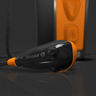
Line: The main body has friendly, flowing lines with a slight curve to make the interface less sharp looking and more approachable. Lines are also created by the colour contrast of the fluro orange and the black. The ear piece is curved to match the contours of the ear and look comfortable and easy.

Balance: The product is completely symmetrical which enables it to lie flat or standing on end.

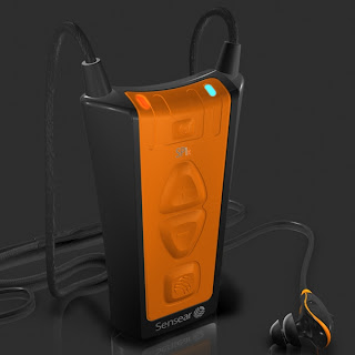
Contrast: The bright colour of the fluro orange and the background colour of black makes the product stand out immensely and shows are clear distinction between the outer case and the inner body. The buttons which are placed on the orange part enables the user to clearly see which area is most important when using the product.

Shape: The Sensear SP1x is a upturned trapezoidal shape.

Patterns: Although no obvious pattern can be seen on the product, the placement of the colours seen can be seen as a type of pattern.

Texture:
The texture of the smooth main body, with its protruding buttons give users ease of use and comfort when holding the product. The rubber used for the ear phones and the line also give the user a familiar feeling of that of a portable music player.

Colour:
The colours of the product, fluro orange and black make the product relevant to the users. As most of the consumers for the product are those in the construction industry, the fluro is appropriate as it allows the consumers to associate the product as a part of their daily work needs.

Balance: Due to its symmetrical trapezoidal form, the product gives the illusion of balance and proportionality.

Scale: The picture above shows that the scale and size of the product is relatively small, therefore it is ergonomically can easily and comfortably fit in the user's hand.

Proportions: The body of the product and the earphones are in proportion to each other as the user is easily able to distinguish which is the main body and which to put in their ears.


More information about the Sensear SP1x can be found at the following websites:

http://designawards.com.au/application_detail.jsp?applicationID=2622
http://www.sensear.com/technology.php
http://www.sensear.com/earplugsp1x.php
http://www.industrysearch.com.au/Products/SP1_and_SP1x_Earplug_System-27928
http://www.westernsafety.com/sensear/sensear.html
http://www.ferret.com.au/c/Sensear/Sensear-wins-2008-DuPont-Innovation-Award-n777201
http://www.sensear.ashop.com.au/p/460614/sp1x.html