Thursday, October 30, 2008

Project Three - Treasuring time


For this assingment i decided to design a height measuring product.


i chose this, as i thought it was a reflection of change and development of children.


It would be a nice sculptural peice to look at, while at the same time have a depth and meaning for the parent.


The target market for the product was parents, with a disposable income.


I wanted to have a sophisticated product, which also had a fun element, so that the child would be able to look forward to the half yearly measuring time.
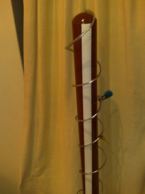
The base would be made out of a nice wood, or a coloured metal.
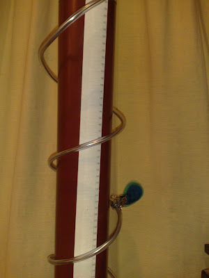
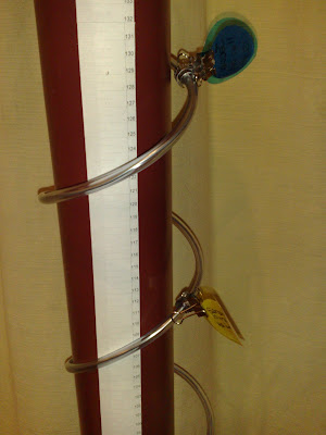
the spiral would be made out of stiff metal tubing.


The reason for the spiral was for a more accurate measurement, and a fun element, so that the child could spin the spiral around , if he./her height did not reach the spiral.


At the top of the spiral, there would be height adjusters, which could be spun down the spiral


and adjusted at the height of the child. The acrylic circles would be matte enough to be written on.
Thursday, October 9, 2008

Task Five: Video Reflections - Seymour Powell - 'Designing Dream Machines'

I think the main message of this video was to show the reality of being a designer and the means of working for a client. It made me realise, that when employed, i would not be only designing things that i wanted to, but had to always keep in mind the client brief, and the requirements that they needed.

The video shows the daily life of a designer and shows the steps of making a finalized product, such as recieving the brief, through to the brainstorming, and the crucial steps to getting the product such as the scooter and the Phantom Bike manufactured to the stage which the client wanted.

I especially learnt that good design is not only something that is functional and nice to look at but it must meet the brief, and we will continually be designing and redesigning to get what the client has asked for. I found the brain storming sessions shown on the video interesting as it showed how intense the design process is. I found it very interesting how the conceptual stages were virtually just ideas, and the end of the process, the product and all the marketing is contrived from just ideas being brainstormed by designers.

Tuesday, October 7, 2008

Bad Design : XBOX


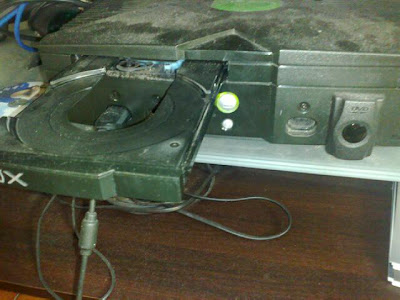
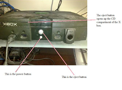
When i recieved this little project, i knew exactly which product i could review. The badly designed product i reviewed is the XBOX console. As shown on the pictures, there are only two buttons on the console yet they cause alot of confusion. These two buttons need urgent redesigning. The 'eject' button and the 'on/off' button are extremely close to eachother, and cause a great amount of confusion. To my suprise, the bigger button which also lights up when turned on, is actually the 'eject' button, and the smaller one is the 'on/off' power button which does not even light up when turned on (shown in pictures). In addition to this problecm, the symbols for each button do not stand out and are just engraved on, which adds to the confusion, as it is hard to see. There have been many a times where i have mixed up the two buttons, which ejects my dvd or turns it off when i am watching.

It is normal for the bigger object or the lit up object to catch the eye of an individual first, and mostly the first eye contact button is percieved to be the 'on/off' switch for most.


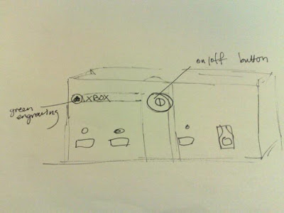
The above shows the newly designed xbox. I have kept consistant with the shape and colour scheme of the xbox. However, i have changed around the button layout so that it is less confusing and leaves less room for human error.
The symbols on the buttons are now coloured in green, to reduce human error and stand out to indicate what each button does. In addition, the 'on/off' button is now the biggest button on the console and stands out more.
The 'eject' button is placed closer to the CD slot so that it is almost impossible to get confused as to which button is which.

Monday, October 6, 2008

Project Two: Postal Presents


Skeleton Ribbed Transparent Purse


The target market for my purse was anyone from primary school year five and up. This is due to the fact that it does require some motor skills and can be challenging. It is meant to be functional and at the same time a fun activity to do.

Although the end product is a conventional purse shape, it is made interesting with the skeleton like ribs on the side, and the ribbon to ensure that coins do not fall out. Also, it is interesting as it is see through.

The material is a thin polypropylene so that it is easy to fold in the gaps and so that the material is not too sharp and can fit nicely in the pocket. Also it is not too brittle to snap.