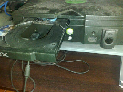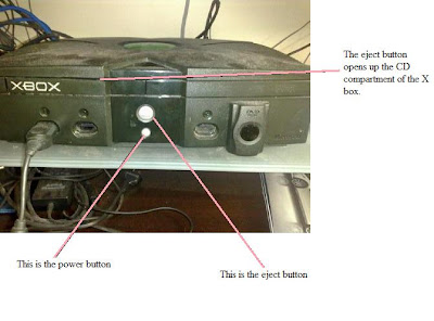


When i recieved this little project, i knew exactly which product i could review. The badly designed product i reviewed is the XBOX console. As shown on the pictures, there are only two buttons on the console yet they cause alot of confusion. These two buttons need urgent redesigning. The 'eject' button and the 'on/off' button are extremely close to eachother, and cause a great amount of confusion. To my suprise, the bigger button which also lights up when turned on, is actually the 'eject' button, and the smaller one is the 'on/off' power button which does not even light up when turned on (shown in pictures). In addition to this problecm, the symbols for each button do not stand out and are just engraved on, which adds to the confusion, as it is hard to see. There have been many a times where i have mixed up the two buttons, which ejects my dvd or turns it off when i am watching.
It is normal for the bigger object or the lit up object to catch the eye of an individual first, and mostly the first eye contact button is percieved to be the 'on/off' switch for most.

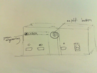
The above shows the newly designed xbox. I have kept consistant with the shape and colour scheme of the xbox. However, i have changed around the button layout so that it is less confusing and leaves less room for human error.
The symbols on the buttons are now coloured in green, to reduce human error and stand out to indicate what each button does. In addition, the 'on/off' button is now the biggest button on the console and stands out more.
The 'eject' button is placed closer to the CD slot so that it is almost impossible to get confused as to which button is which.
No comments:
Post a Comment